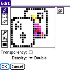
Part of the measure of how realistic an icon is does not depend of actual realism, but rather on illusory combinations of the elements that make it up. For instance, it's totally impossible to make an icon of the Mona Lisa with any semblance of realism by trying to map it out pixel by pixel. Rather, youre going to have to blend colors efficiently on your tiny canvas, in order for the final product to resemble the Mona Lisa.
In line with this, its crucial that you always maximize your color palette, and make proper use of color swatches, IF the color picker you are using supports them. Most do. (Color swatches are little boxes which you may drag the selected color to for use later.) If your editor doesnt support swatches, you may wish to make exact notes of the RGB values of the colors you frequently utilize so that you can go back to them in the future.
It takes time to learn how to make the most advantageous use of this kind of graphical illusion, so dont fret if you have difficulties with it.
Here are some good examples of illusory images:
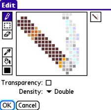
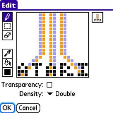
Naturally, if youre using a black & white icon editor, you cant use color or shading to make these illusions, so youll have to resort to more traditional or drastic techniques and make heavy use of staging to pull off your finished design.
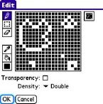
This icon uses only black and white pixels with staging to illustrate the classic video game Asteroids:
Shady Business
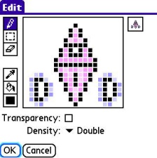
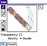
Another important thing to remember is that without proper shading, an icon will look totally flat and bland. To employ shading techniques, choose a color that contrasts the primary color slightly, either darker or lighter. This lets you give the illusion of depth to an icon, thus making a circle a sphere, a square a cube or box, or a diamond sparkly. Try out a range of different hues until the images look just right, then remember what combinations you used so you can repeat them the next time you need to do so.
Try this technique using these examples as a guide.
Color Me Crazy
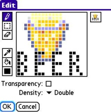
When designing color icons, remember that just as too many cooks spoil the broth, too many colors mixed together ruin an icon. Always make sure that your colors provide a balanced contrast, and never mix them in such a way as that they blur together on-screen in your final product. Remember: too many colors used in an image make it hard to see, so as a rule, four to eight colors are your safest bet. You may offset these with one shade lighter or darker for shading purposes, but try to keep the total amount of colors you use under twelve.
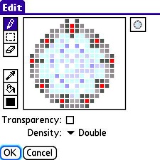
The following designs employ clever use of all of the above techniques.
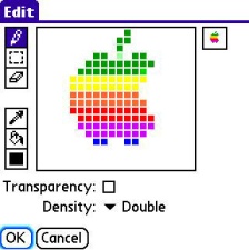
I'd also advise that if you're trying to make an icon that apes a real-world object, corporate logo, or other familiar glyph, have that real thing available to use as a reference. For example, when I made the Apple logo above, I had an image of the old Apple logo on my laptop to use as a reference. Flip back and forth between the big image and your final product to compare them, and adjust as needed until you reach an outcome that is appealing to you.
Like any other up-close work, sometimes you'll get so absorbed in it, you'll just plain get bleary-eyed, lose your focus and get stuck, stare at the screen, and feel lost.. artistic block, just like writers' block.. at those times, do whatever it takes to refresh yourself.. get up, have a snack, listen to some music, walk the cat, take a nap, until the muse strikes you again..
Next Page: End Results >>